How Buildings Learn
by Stewart Brand
- Nonfiction
- Shelves: architecture, design, complexity, urbanism, ecology
- 252 pages
- ISBN: 9780140139969 (Goodreads)
- Format: Paperback
- Buy on Amazon
A while back I was watching this talk given by Stewart Brand and Paul Saffo on Brand’s notion of “pace layering”. During the introduction, he makes reference to his book How Buildings Learn, nominally a book on architecture, but as he discovered from readers, they found in it so much more:
It’s interesting, if you look through the many Amazon reviews of the book, quite a lot of people decided it was actually about software, and systems, and systems design. And this reviewer ends with “the book might have something to say about buildings, too.” About a third of the reviews are like this.
I knew little about the book going into it, but this tracks with why I found How Buildings Learn so insightful, broad, and profound. How does a book about architecture hit so many nerve centers? I enjoy architecture as a subject itself, but the book resonates as one of the most thought-provoking works I’ve read on design and how things are made and maintained in general — from buildings and urban planning, to software, to education, to manufacturing, and even governance and culture.
HBL talks about how things are built, how to create lasting, meaningful things, how to build things that get used, and are fit for their use. And how humans and our environs are interdependent complex systems.
Brand observes early in the book that buildings learn and evolve from interacting with their users. Over time, the needs of the user change, and buildings must adapt through the user’s modifications. But buildings can also shape and guide our uses of them. Brand cites Winston Churchill’s famous line:
“We shape our buildings, then our buildings shape us”
But extends the metaphor to capture this evolution:
“We shape our buildings, they shape us, we reshape them, they reshape us”
It’s a repetitive cycle. Successful architecture is that which finds the balance between adaptability and its fitness for a purpose. The purposes change, the building must change. But buildings must be more than empty husks. The right path for the architect is to find the right altitude.
And the systems of a building nest together in an interconnected hierarchy.
Shearing Layers
The farthest-reaching idea in HBL is that of “shearing layers”, which Brand later elevated into the broader notion of pace layering. Shearing layers comes originally from architect Frank Duffy, who described a building in terms of hierarchical layers that move and adapt on different time scales:
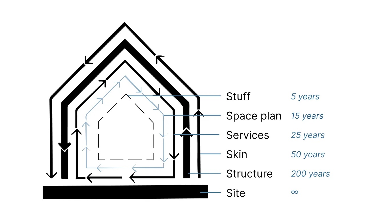
Change at a given layer of the hierarchy tends to happen (or to be demanded by the user) on different time scales. Site and Structure border on immutable without complete tear-down, whereas the Stuff and Space plan change with the whims of the inhabitants. The Services layer might be the most contentious in typical residential and commercial buildings, since mechanicals like wiring, plumbing, and HVAC tend to be buried or partially submerged into the Structure, but evolve based on the changing nature of the demands within. When electricity and central air became a thing, houses had to undergo major surgical retrofit to incorporate these new demanded technologies. And the evolution of uses — an old textile plant being repurposed into a WeWork, say — requires these shearing layers to shift. Too much entanglement between layers, and that evolution can be extremely painful or implausible.
There’s a whole post to be made breaking down how this concept transfers to other domains. In his later book The Clock of the Long Now, Brand abstracted the idea to the meta concept of pace layering, where he draws out the same hierarchical stack from the fast-moving fashion and commerce, to the slow and deliberate culture and nature.
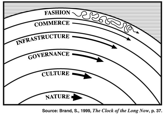
Brand expands here:
Fast learns, slow remembers. Fast proposes, slow disposes. Fast is discontinuous, slow is continuous. Fast and small instructs slow and big by accrued innovation and by occasional revolution. Slow and big controls small and fast by constraint and constancy.
Adaptations in the faster layers become signals to changes that might be on the horizon in the slower ones. Inside of a building, in the realm of the Space Plan, you could observe the changing nature of layout and how inhabitants make use of a space, and begin to see an encroachments that could be incorporated into a permanent accommodation in the Services and Structure of the building.
We want adaptability in our buildings. There’s really no other way for a building to last and to be appreciated if it’s not amenable to our shifting needs. In order for this to happen, we need to think of the layers as having sort of transition area between them, and to plan for “slippage” in these estuarial mixing zones:
A design imperative emerges: An adaptive building has to allow slippage between the differently-paced systems of Site, Structure, Skin, Services, Space plan, and Stuff. Otherwise the slow systems block the flow of the quick ones, and the quick ones tear up the slow ones with their constant change. Embedding the systems together may look efficient at first, but over time it is the opposite, and destructive as well. (Page 20)
Whether designing buildings, or software, or business processes, feedback loops are essential to the flowing adaptation of the system. Christopher Alexander built his career and a library of work this subject:
“Things that are good have a certain kind of structure. You can’t get that structure except dynamically. Period. In nature you’ve got continuous very-small-feedback-loop adaptation going on, which is why things get to be harmonious. That’s why they have the qualities that we value. If it wasn’t for the time dimension, it wouldn’t happen. Yet here we are playing the major role in creating the world, and we haven’t figured this out.”
Low Road, High Road, No Road
Last year I wrote a piece about MIT’s Building 20, a textbook example of what Brand describes as a “low road” building. In that post I laid out the differences between these types:
Low Road buildings are characterized by their flexibility and adaptability to change, designed with simple, robust components that can be easily modified or replaced without compromising the overall structure. They allow incremental, organic evolution over time without requiring major interventions or extensive renovations.
In contrast High Road buildings are less adaptable and have a more fixed design, often constructed with specialized and intricate systems that are difficult to modify or update. They tend to exhibit a higher level of architectural ambition and style. Their rigidity makes them less resilient to change and less capable of responding to evolving user demands.
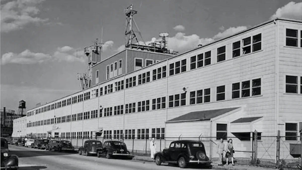
In the way they’re described, it seems like Brand is praising the low road approach over the high, but the merits are relative: the appropriate style depends on the building’s purpose. Low Road fits better for general workplaces and most residential needs — highly adaptable, cost-effective, still possible to beautify through deft usage and modification of the faster layers. High Road may be preferable when we want to intentionally define the building’s purpose for longevity. Cathedrals and opera houses are built for intents that we want to preserve. We want the opera house to guide its users, not the other way around.
Oftentimes, buildings have their own ideas, regardless of the architect’s plan:
Temporary is permanent, and permanent is temporary. Grand, final-solution buildings obsolesce and have to be torn down because they were too overspecified to their original purpose to adapt easily to anything else. Temporary buildings are thrown up quickly and roughly to house temporary projects. Those projects move on soon enough, but they are immediately supplanted by other temporary projects―of which, it turns out, there is an endless supply. (Page 28)
Where things go sideways is when the style doesn’t match the purpose. Where we don’t have fitness to the environment.
But the real scourge of the discipline, as Brand sees it, is No Road — what he terms “magazine architecture”. Design for other designers, not for users. Design for the visual aesthetics, for the magazine spread, for the top-down “look” or the clever use of form and nonfunctional features. No Road buildings are overdesigned. The architect conceives of a concept, vision, or a collection of ideas toward their imagined purpose, and proceeds to address every detail in the final form with little thought to uses outside the ones they predict or intend.
A quick list to differentiate these categories might look like this:
- Low Road: discovered, adapted purpose
- High Road: guided, intended, preserved purpose
- No Road: no purpose
Architecture as a profession advertises a totalitarian approach that fundamentally resists change, and change is guaranteed as a building ages. Architects should design and plan some but not all of a building, but incentives push toward a complete, rounded, high-degree-of-finish product. The designers often carry the ball too far, when the best approach would be to leave many of the “fast” details open-ended. Spend the most time and money on the immobile, lasting slow layers, and less on the more ephemeral Skin, Services, and Space Plan layers.
There’s a fun takedown of Frank Lloyd Wright — probably the most renowned American architect — for his beautiful but poorly-functioning works of art.
Wright’s late-in-life triumph, Fallingwater in Pennsylvania, celebrated by the AIA poll as “the best all-time work of American architecture,” lives up to its name with a plague of leaks; they have marred the windows and stone walls and deteriorated the structural concrete. To its original owner, Fallingwater was known as “Rising Mildew,” a “seven-bucket building.” (Page 58)
“Magazine” buildings like Fallingwater were never built to be changed. Wright was a proponent of the “central planning” view of architecture: the designer knows the plan, no need for future edits.
Change shouldn’t be considered an irritation for the designer to deal with. It should be assumed and incorporated. Buildings (with human occupants) are living things.
Art versus Craft
Is architecture an art, or a craft? I think where Brand comes down on this is that architecture as an academic, professional discipline has, over time, become an art. Historically, the architect was also the builder, brickmason, carpenter, and furniture-maker, and often the eventual occupant. There was no such thing as a structure built to impress other architects, or to win awards. Buildings were built to do something, to house people doing things.
Brand says art is “proudly non-functional and impractical”, “reveres the new and despises the conventional”. On the other hand, a craft implies utility, expertise, and functionality. He quotes Henry Glassie:
“If a pleasure-giving function predominates, the artifact is called art; if a practical function predominates, it is called craft.”
Art’s bucking of the conventional is where it clashes most with what buildings need. Buildings are complex hierarchies of elements, existing in a complex natural environment with complex inhabitants, over a long time. Sure, convention is “boring”, but it became a reusable pattern because it reliably performed over time.
Art must be inherently radical, but buildings are inherently conservative. Art must experiment to do its job. Most experiments fail. Art costs extra. How much extra are you willing to pay to live in a failed experiment? Art flouts convention. Convention became conventional because it works. Aspiring to art means aspiring to a building that almost certainly cannot work, because the old good solutions are thrown away. The roof has a dramatic new look, and it leaks dramatically. (Page 54)
Architecture as art disrespects the Chesterton’s fence of the traditional method.
Designers versus users
Architects and users start with some fundamentally opposing motives. The user hasn’t even occupied the space yet, and can’t possibly know the ways their needs will evolve. The architect is incentivized to deliver a total, visionary package. With architects and builders compensated on the total cost of the building, the push “encourages buildings that try to be too perfect and too large too soon.”
I love this quip about the model-making process — where the designer builds a detailed scale model of the entire building pre-construction to show the customer. The fallacy of knowing what needs built while sitting around a conference table:
“A lot of the time now, you see buildings that look exactly like their models,” one model maker told me. “That’s when you know you’re in trouble.”
One of the key steps, and most contentious ones, in the process of building is what’s termed “inhabitation”, when the occupant takes the reins from the builder and actually moves in. This is their first experience actually using the space as intended. It could be a year or more into the engagement and still nothing has been learned about the actual reality of its functionality (or lack thereof).
Users know what’s best — because 5 or 10 or 20 years on, only those users can know their intended uses. The architect of days gone by could not have predicted.
Cultural context, tradition, and tacit knowledge
A few months ago I wrote a post called Designing from Experience, Not Expertise, on the idea of “vernacular architecture”, which refers to style and design that’s highly adaptive to the local culture, environment, available materials, and tradition. The bungalows of India, timber-framed longhouses of Scandinavia, or the open-air courtyards of Mediterranean villas. Vernacular architecture use to be all forms of design and building: people built the things they needed for the purposes they had with the things around them.
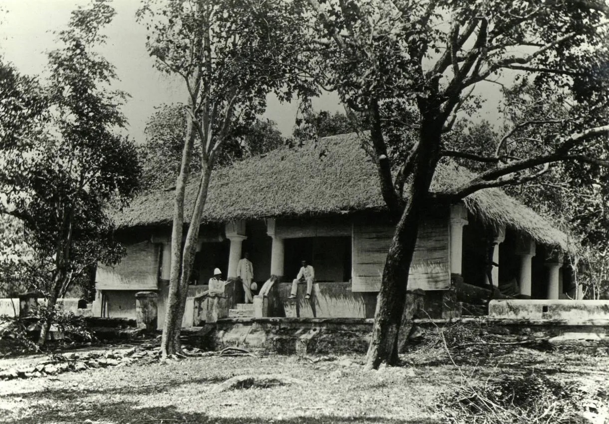
When architects, designers, or even urban planners want to emulate a design or feature they adore from elsewhere, they tend to fixate on the look or the finished result, and not the process of how it got that way. Brand cites Joel Garreau, who wrote about cities and how they evolve:
“Cities are always created around whatever the state-of-the-art transportation device is at the time. If the state of the art is sandal leather and donkeys, you get Jerusalem…. The combination of the present is the automobile, the jet plane, and the computer.”
Buildings work the same way: they’re built in a particular context with particular goals, adapting to a set of localized constraints in usage and materials.
I liked this anecdote about Venice:
“Those who now romanticize Venice collapse a thousand years of history. Venice is a monument to a dynamic process, not to great urban planning…. The architectural harmony of the Piazza San Marco was an accident. It was built over centuries by people who were constantly worried about whether they had enough money.” Gerkins: “The Piazza San Marco was not planned by anyone…. Each doge made an addition that respected the one that came before. ^^That is the essence of good urban design—respect for what came before.^^”
The modern urbanism movement often seeks to mimic the current state of places like this without all of the prerequisite stages that led to it. We want to make city centers more walkable, build light rail systems, or impose other forms of city design without an appreciation of how cities with them evolved. The quaint, narrow streets of a French village were built for horses, before cars — they weren’t built narrow for coziness or some other factor.
This is no defense of our restrictive city layouts with their over-reliance on automobiles. But an acknowledgement of that evolution. Many American cities expanded in the age of the car, and they reflect that. Our error was the lack of appreciation or valuing of the benefits of the “old way” of building. We didn’t realize we’d miss the beauty and functionality of the walkable city center until we overbuilt its alternative.
Vernacular design begins with fit-for-purpose, pragmatic approach to building, then assumes change.
Vernacular buildings evolve. As generations of new buildings imitate the best of mature buildings, they increase in sophistication while retaining simplicity. They become finely attuned to the local weather and local society. A much-quoted dictum of Henry Glassie’s states that “a search for pattern in folk material yields regions, where a search for pattern in popular material yields periods.” (Page 132)
The Reach to Other Domains
At the start of the piece I mentioned how much of How Buildings Learn is relevant to domains other than architecture. There’s so much here that can be translated to fields like software product design, educational institutions, and company building. The ideas here reach far as properties and observations about complex systems in general. All complex, multifaceted systems contain their own versions of pace layered hierarchies, bottom-up vs. top-down design dynamics, and feedback loops as sources of learning or suppression.
The book is a consideration of architecture as a dynamic craft — the way it could/should be — rather than a static art, the way it often is in practice. The dynamic view respects buildings as long-lived entities, not simply fixed structures to be drawn on paper, constructed from wood and glass, then photographed for the awards show. Buildings are living entities we inhabit and modify and enjoy, and we ourselves are idiosyncratic and unpredictable in what we want to do with them. But a user-centered approach treats the field as a push-pull two-sided interaction between designer and user. The optimum outcome happens when designer appreciates and learns from user.