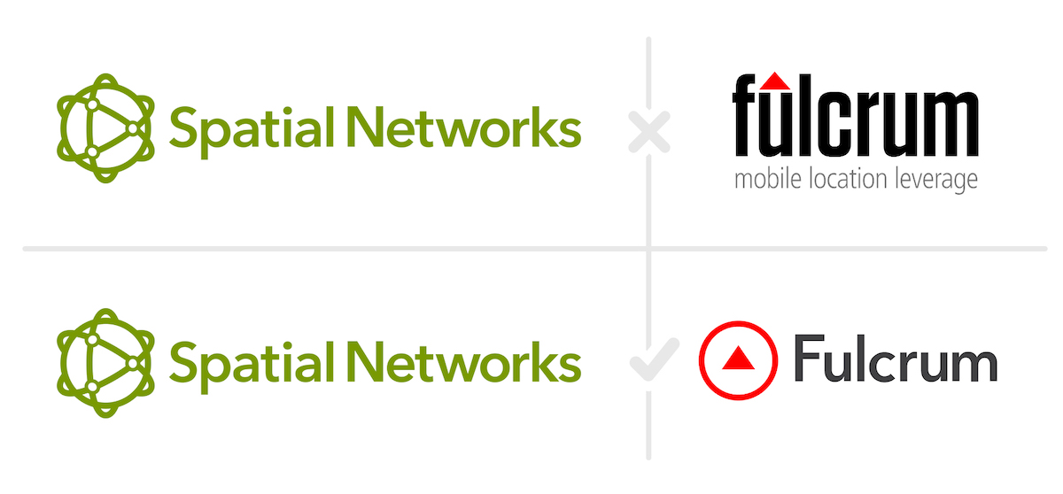
Fulcrum's New Look →
March 29, 2019 • #We just finished up a several-month’s-long effort updating the design and branding of Fulcrum, from the logo to typefaces, to web design and all. As happens with these things, it took longer than we wanted it to when we started, but I’m very pleased with the results.

Tim’s post here covers the background and approach we took to doing this refresh:
Sometimes it seems companies change their logos like people change their socks. Maybe they got a new marketing director who wanted to shake things up or a designer came up with something cool while experimenting after hours. We, on the other hand, have never changed our logo. The brief came down the pipeline in 2011 to create a logo for a new initiative called Fulcrum. Many pages of sketches and a few Adobe Illustrator iterations later, the only logo Fulcrum would know for 8 years was born.
We don’t take projects for rebranding lightly. Changing this kind of thing too often doesn’t impact the bottom line value to your users, can be a confusing moving target for brand recognition in the marketplace, and just plain takes time away from more valuable things. But in our case the need was two-fold: bring the look and feel in line with our family of other brands, and clean it all up after 8 years with our old look.
- 11:59 September 10 — A tribute to a tradition at Spatial Networks.
- Fulcrum's Report Builder — Launching Fulcrum's Report Builder.
- 2020 Ready: Field Data Collection with Fulcrum — Hosting a webinar to talk about Fulcrum for disaster relief.