OmniFocus 2 for iPhone
I’m an OmniFocus-flavored GTD adherent, or try to be. The iOS apps for OmniFocus were huge contributors to my mental adoption of my own GTD system. When OmniFocus 2 dropped a few weeks back for iPhone, I picked it up right away.
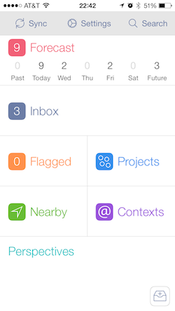
 The new design lines up with the iOS 7 look. I really dig the flat UI style in utility apps like OmniFocus, or any app where function truly overrides form in importance—typically anything I open dozens of times of day as part of my routine. The new layout gives weight and screen real estate to the things you access more frequently, like the Inbox, Forecast, and Perspectives views. I’m really liking the inclusion of the Forecast view as a first-class citizen, with the top row devoted to giving you context on the next week out for tasks with deadlines.
As before, there’s a fast “Add to Inbox” button for quick capture. But rather than a button positioned somewhat arbitarily in a bottom navigation menu, it’s now an ever-present floating button, always in the bottom right for rapid inbox capture. Upcoming and overdue tasks are now symbolized with colored dots when in sub-views, and with colorized checkboxes in list views. The color highlights fit the iOS 7 aesthetic nicely, and give subtle indications of importance.
Like any effective design, the right balance of positioning and subtlety actually makes it clear how a feature should be used, and makes it simpler for you to integrate with your workflow. In past OmniFocus versions, I had a hard time figuring out how to make use of due dates (and start dates) properly, so I leaned away from using them.
With the latest iOS update, OmniFocus is now not only a tool that follows a GTD workflow, but one that actually leads you into better GTD practice.