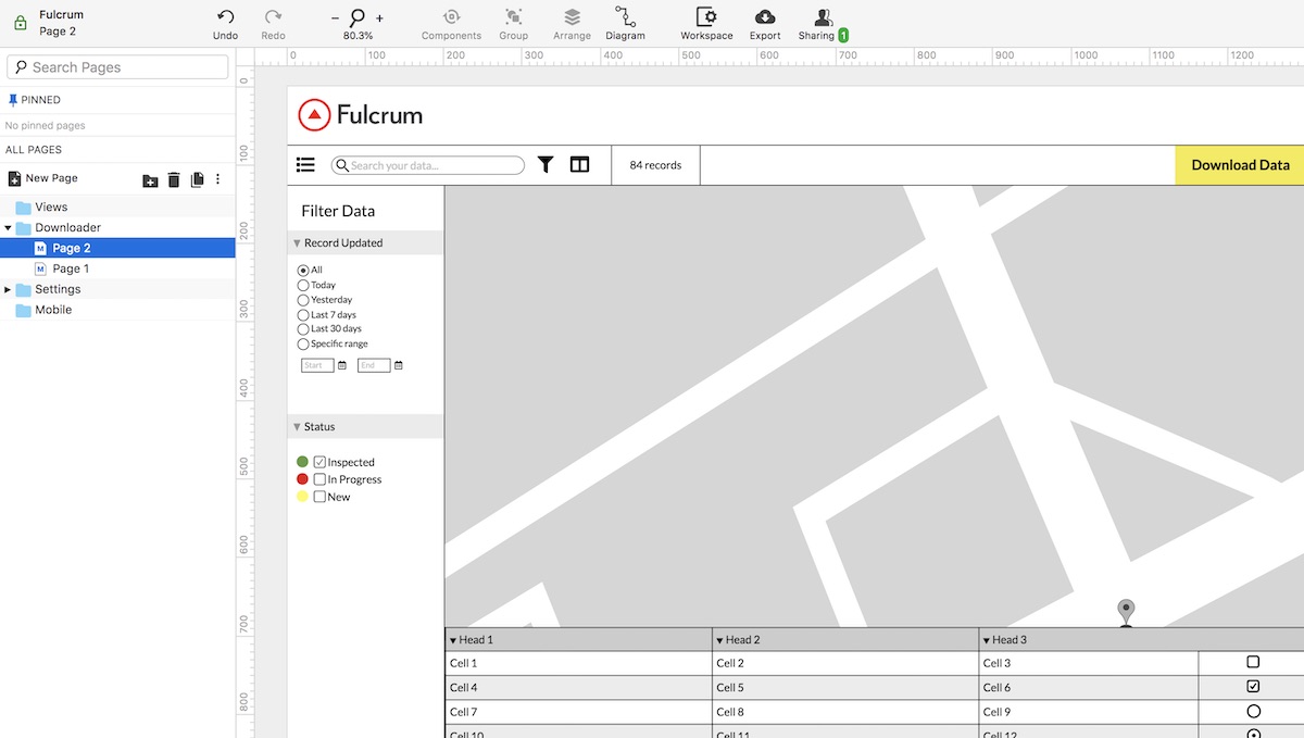
Wireframing with Moqups
Wireframing is a critical technique in product development. Most everyone in software does a good bit of it for communicating requirements to development teams and making iterative changes. For me, the process of wireframing is about figuring out what needs to be built as much as how. When we’re discussing new features or enhancements, rather than write specs or BDD stories or something like that, I go straight to a pen and paper or the iPad to sketch out options. You get a sense for how a UI needs to come together, and also for us visual thinkers, the new ideas really start to show up when I see things I can tweak and mold.
We’ve been using Moqups for a while on our product team to do quick visuals of new screens and workflows in our apps. I’ve loved using it so far — its interface is simple and quick to use, it’s got an archive of icons and pre-made blocks to work with, and has enough collaboration features to be useful without being overwhelming.

We’ve spent some time building out “masters” that (like in PowerPoint or Keynote) you can use as baseline starters for screens. It also has a feature called Components where you can build reusable objects — almost like templates for commonly-used UI affordances like menus or form fieldsets.
One of the slickest features is the ability to add interactions between mocks, so you can wire up simulated user flows through a series of steps.
I’ve also used it to do things like architecture diagrams and flowcharts, which it works great for. Check it out if you need a wireframing tool that’s easy to use and all cloud-based.