I miss Eugene Wei’s epic tech analyses. His latest serves as a sort of eulogy for Twitter. He’s of the opinion that “peak Twitter” is in the rear view, and the platform seems to be on a continuous decline over the past year, for the reasons I’m sure you suspect even if you don’t agree.
He makes some interesting points on the failings of Elon and the directional changes in culture and resourcing. While the product was obviously stagnant and incredibly slow at innovation, there have been some, let’s say questionable major changes in the last 12 months. Shipping is great. But shipping for shipping’s sake? Maybe not so much. Many of the changes when viewed from the outside — the yoyo-ing around with Twitter Blue subscriptions, the mind-bending rate limiting decisions, blocking whole domains from being linked to, then unblocking them — we’ve got a nice little list of bizarre experiments that seem unmoored from its success as a business.
No one has been able to explain exactly how Twitter could grow continuously (though slower than your typical unicorn startup) for the past 15 years, especially with so little in the way of new capabilities of the product. 15 years is multiple lifetimes in the tech universe.
I think the key observation is that Twitter found generational product-market fit over a decade ago, but hasn’t been able to explain or understand how that PMF exactly works. What ingredients and magic alchemy came together to create such an unkillable product? As the newfound czar of the product, Elon hasn’t decoded it either. Tinkering with the timeline algorithm has made it demonstrably worse, as I’m sure most power users agree. I like how Eugene puts it:
The changes to the Twitter algorithm bulldozed over a decade’s worth of Chesterton fences in a few months.
It’s not that the old algo was perfect. But something about its particular tuning methodology was clearly desirable, which we appreciated once it was taken away.
Here’s Eugene again, in summary:
For this reason, Twitter won’t ever fully vanish unless management pulls the plug. None of the contenders to replace Twitter has come close to replicating its vibe of professional and amateur intellectuals and jesters engaged in verbal jousting in a public global tavern, even as most have lifted its interface almost verbatim. Social networks aren’t just the interface, or the algorithm, they’re also about the people in them. When I wrote “The Network’s the Thing” I meant it; the graph is inextricable from the identity of a social media service. Change the inputs of such a system and you change the system itself.
I’m not going anywhere. Threads is uninteresting to me. Twitter is mostly still fine. And Farcaster is my second home and exit strategy.
This is a wild story and an incredible piece of investigative journalism from the folks at BuzzFeed. The CCP reportedly operates hundreds of camps across the Xinjiang autonomous region for re-education of Uyghur muslims.
Starting with map tiles they’d noticed were blanked out on China’s Baidu Maps service, they enlisted new data resources, built analysis tools, and combed through map data manually to identify hundreds of these prisons (only several dozen are “officially” known):
We began to sort through the mask tile locations systematically using a custom web tool that we built to support our investigation and help manage the data. We analyzed the whole of Kashgar prefecture, the Uighur heartland, which is in the south of Xinjiang, as well as parts of the neighboring prefecture, Kizilsu, in this way. After looking at 10,000 mask tile locations and identifying a number of facilities bearing the hallmarks of detention centers, prisons, and camps, we had a good idea of the range of designs of these facilities and also the sorts of locations in which they were likely to be found.
They used data tasked on-demand by Planet’s satellite constellation (and granted for free for the project, so big ups to the Planet team there!) to find hundreds more of these:
In total we identified 428 locations in Xinjiang bearing the hallmarks of prisons and detention centers. Many of these locations contain two to three detention facilities — a camp, pretrial administrative detention center, or prison. We intend to analyze these locations further and make our database more granular over the next few months.
Of these locations, we believe 315 are in use as part of the current internment program — 268 new camp or prison complexes, plus 47 pretrial administrative detention centers that have not been expanded over the past four years.
This story gets more shocking every day. It’s hard to believe the resounding silence pretty much worldwide of any government response to this going on. Eric Weinstein recently had a podcast episode about Arthur Koestler’s (author of Darkness at Noon 1944 essay called “The Nightmare That is a Reality,” in which Koestler marvels at the world’s lack of belief and response to the ongoing Holocaust. It was written long before the Allies began to liberate the camps and see for themselves in person what was going on.
Today we have cameras in the sky capable of bypassing lying, twisted regimes of secrecy, but don’t seem to want to believe the truth any more now than we did in 1944.
Matthew Ball dives into Nintendo’s potential and what differentiates its culture from the rest of its media and gaming comparisons, like Disney.
The section on their mobile performance is particularly shocking. I knew Nintendo hadn’t been that engaged in trying to compete in mobile gaming (meaning iOS and Android), but it’s been a lot worse than I thought. Seems like it would be a dead-on win for them.
Obviously, Nintendo’s share of the economics declines across each group. This, itself, is not a problem. What’s a problem is that the greater Nintendo’s involvement, the less successful a mobile title seems to be. Nintendo’s mobile creative seems to erode the success of a title more than its IP lifts it. Put another way, Nintendo’s involvement increases margins but decreases revenue by an even greater degree.
I didn’t realize until reading this piece that this movie was a commercial flop. $70m gross on a $76m budget. I remember seeing this several times in theaters, and many times after. This retrospective (from 2016) brought the film back to mind and makes me want to rewatch.
Google Earth led us to vastly overestimate the average user’s willingness to figure out our map interfaces. The user experience was so novel and absorbing that people invested time into learning the interface: semi-complex navigation, toggling layers on and off, managing their own content, etc. Unfortunately, our stuff isn’t so novel and absorbing and we’ve learned the hard way that even those forced to use our interfaces for work seem very uninterested in even the most basic interactions.
What’s happening between the New York Times and psychiatrist-rationalist-blogger Scott Alexander is incredibly disappointing to see. In writing a story including him, they want to use his real name (which they found out somehow, S.A. is a pseudonym), which seems completely unnecessary and absurd to the point of disbelief — given the Times’ behavior and policies of late, there should be little benefit of the doubt given here. As a result of this, Scott has deleted his blog, one of the treasures of the internet.
The more I use Figma, the more convinced I become that their approach to design tooling is unique. The first impression I got slotted it mentally in with tools like Sketch, Moqups, and in some ways even Adobe Illustrator or Photoshop. Academically I knew it was “different” than using a true power tool like Photoshop, but the first impression back in 2017 was a lot closer to that than where I’d place it after spending time with it.
In this piece, Kevin Kwok dives deep on Figma’s product and business dynamics, getting at the core of what’s unique about the product versus its competitors in the space. I agree with his ideas here about what Figma can do to elevate design higher into an organization’s decision making process. Bringing wider teams of people into the meat of the iterative design process and allowing the non-technical to meaningfully contribute makes design into a more central piece of an org, rather than how it’s largely been historically treated (a “support” function to PMs, engineers, and marketers). No longer should it be “have a designer make a comp,” but rather, a marketer playing a participatory role in creating that comp.
Historically it has been very difficult for non-designers to be involved during the design process. If PMs, engineers, or even the CEO wanted to be involved, there were many logistical frictions. If they wanted the full designs, the designer would need to send them the current file. They’d then need to not only download it, but also make sure they had the right Adobe product or Sketch installed on their computer—costly tools that were hard to justify for those who didn’t design regularly. And these tools were large, slow, specialized programs that were unwieldy for those not familiar with using them. It was hard to navigate a project without a designer to walk you through it. Comments were done out of band in separate emails. Even worse, if a designer made an update before viewers had finished looking at the file, the file would be out of date—without the viewer being aware.
A great post on various things coronavirus from Scott Alexander. The utility and tradeoffs of lockdowns, virus transmission, country by country differences, and more.
Bessemer maintains this page of companies they passed investing on. I like the idea of publicly acknowledging your big misses or errors as an organizational accountability tool. Some big names here like eBay, Airbnb, Google, and FedEx.
Almost a year ago I shared a link to the first version of Downlink. The main feature added here is you can create your own custom views by putting a bounding box around your area of interest. Then you’ll get a live look at the Earth as your desktop background.
A collection tool for retrieving and analyzing Twitter data. I’ve seen some neat social network analyses shared from folks that have used this to map degree relationships between Twitter accounts.
A great piece from the Atlantic’s George Packer, a transcript of his acceptance speech for the Hitchens Prize.
At a moment when democracy is under siege around the world, these scenes from our literary life sound pretty trivial. But if writers are afraid of the sound of their own voice, then honest, clear, original work is not going to flourish, and without it, the politicians and tech moguls and TV demagogues have less to worry about. It doesn’t matter if you hold impeccable views, or which side of the political divide you’re on: Fear breeds self-censorship, and self-censorship is more insidious than the state-imposed kind, because it’s a surer way of killing the impulse to think, which requires an unfettered mind. A writer can still write while hiding from the thought police. But a writer who carries the thought police around in his head, who always feels compelled to ask: Can I say this? Do I have a right? Is my terminology correct? Will my allies get angry? Will it help my enemies? Could it get me ratioed on Twitter?—that writer’s words will soon become lifeless. A writer who’s afraid to tell people what they don’t want to hear has chosen the wrong trade.
It might seem obvious that savings is your ability to reject what you could spend. But the majority of financial goals are about earning more – better investment returns and a higher-paying career. There’s nothing wrong with that. Earning more is wonderful, just like exercise. We just shouldn’t lose sight of the fact that earning more will do little for building wealth if every extra dollar is offset by a dollar of new spending.
The world is filled with the financial equivalent of athletes who finish every workout with four Big Macs. Wealth, at every income level, has less to do with your gains and more to do with your ability to leave gains alone without cashing them in.
An interesting response argument to Kevin Kwok’s post from a while back called the Arc of Collaboration. The meat of the argument is that corralling notifications from the dozens of input streams we all have is challenging, and that a “command line”-style interface like Superhuman’s could function as a filter point to visualize the input stream, but also engage with items in real time. A compelling case with mockups of how it could work (if service providers wanted to plug into this sort of “notification nexus”).
“Tech domination”, monopolies, regulation — lots of concepts, fears, and proposed remedies are all getting confused these days in tech. Benedict Evans had this piece of sober analysis to peel apart the differences between companies being rich, dominant in their product space, or dominant in the wider industry.
The tech industry loves to talk about ‘moats’ around a business - some mechanic of the product or market that forms a fundamental structural barrier to competition, so that just having a better product isn‘t enough to break in. But there are several ways that a moat can stop working. Sometimes the King orders you to fill in the moat and knock down the walls. This is the deus ex machina of state intervention - of anti-trust investigations and trials. But sometimes the river changes course, or the harbour silts up, or someone opens a new pass over the mountains, or the trade routes move, and the castle is still there and still impregnable but slowly stops being important. This is what happened to IBM and Microsoft. The competition isn’t another mainframe company or another PC operating system - it’s something that solves the same underlying user needs in very different ways, or creates new ones that matter more.
You may have thought the entire 14th century was prettybad, or maybe 1918 with its flu pandemic and millions of war casualties, but how about the 6th:
A mysterious fog plunged Europe, the Middle East, and parts of Asia into darkness, day and night—for 18 months. “For the sun gave forth its light without brightness, like the moon, during the whole year,” wrote Byzantine historian Procopius. Temperatures in the summer of 536 fell 1.5°C to 2.5°C, initiating the coldest decade in the past 2300 years. Snow fell that summer in China; crops failed; people starved. The Irish chronicles record “a failure of bread from the years 536–539.” Then, in 541, bubonic plague struck the Roman port of Pelusium, in Egypt. What came to be called the Plague of Justinian spread rapidly, wiping out one-third to one-half of the population of the eastern Roman Empire and hastening its collapse, McCormick says.
That sort of worldwide famine caused by devastating volcanic eruptions would’ve been impossible to deal with. And the Plague of Justinian was no small thing either, thought to have killed up to 25% of the global population.
The Remembrance of Earth’s Past trilogy (translated by Ken Liu and featured here) is one of the best sci-fi works there is, regardless of origin or era. I also read and enjoyed Liu’s Paper Menagerie collection of short stories. I didn’t realize how involved he was personally in bringing so much new material here, and introducing so many Chinese authors to wider audiences:
He has found sci-fi stories in unusual corners of the internet, including a forum for alumni of Tsinghua University. Chinese friends send him screenshots of stories published on apps that are hard to access outside of China. As an emissary for some of China’s most provocative and boundary-breaking writers, Liu has become much more than a scout and a translator. He’s now a fixer, an editor and a curator — a savvy interpreter who has done more than anyone to bridge the imagination gap between the world’s current, fading superpower and its ascendant one.
His job as a translator, given the sensitivities of the material and the players involved, is a complex one:
“It’s a very tricky dance of trying to get the message that they’re trying to convey out, without painting the writers as dissidents,” Liu told me over coffee one day, as we sat in the kitchen of his home in Massachusetts. “A lot of Chinese writers are very skilled at writing something ambiguously, such that there are multiple meanings in the text. I have to ask them, how explicit do you want me to be in terms of making a certain point here, because in the original it’s very constrained, so how much do you want me to tease out the implications you’re making? And sometimes we have a discussion about exactly what that means and how they want it to be done.”
We’ve not scratched the surface much on Slack’s Shared Channels feature, but where we have it definitely makes staying plugged in with important tangential networks (like customers and partners) dead simple and much more engaging.
This network analysis uses some interesting visualizations to show the topology of the network, with its subnetworks creating a connection graph of communication pipes.
Also on an hourly basis, these mini-networks from the outer ring get sucked into the internal mega-network, as connections are formed between organizations on the inside and the outside. The overall result is a roiling sea of proto-networks surrounding an ever-expanding network of super-connected teams.
Alex Tabarrok linked to this detailed deck from Alon Levy picking apart the possible reasoning for why NYC subway construction is so much more than other urban centers around the world.
Levy is to be lauded for his pioneering work on this issue yet isn’t it weird that a Patreon supported blogger has done the best work on comparative construction costs mostly using data from newspapers and trade publications? New York plans to spend billions on railway and subway expansion. If better research could cut construction costs by 1%, it would be worth spending tens of millions on that research. So why doesn’t the MTA embed accountants with every major project in the world and get to the bottom of this cost disease?
Patrick Collison poses and tracks possible responses to broad questions on his website. In one, he asks:
Why are certain things getting so much more expensive?
Spending on healthcare in the US is up 9X in real terms since 1960. K12 education spending in the US has increased by 2-3X per student per year since 1960. The cost of college in the US has more than doubled (again, in real terms) since 1984. Growth in everything from construction costs to childcare costs is significantly outpacing inflation. Lots more at SSC and from Tyler.
What’s going on? Why are we seeing dramatic declines in costs in many areas of the economy and such steep increases in others? How much of the cost growth is unmeasured improvement in quality and how much is growing inefficiency? How should one predict a priori whether a sector will exhibit increasing or decreasing costs relative to inflation? What do we do about it all?
Economist Arnold Kling had an interesting response to this in a short essay on, in particular, health care and education. One (very visible) factor is category creep, of which we’re all familiar:
Measurements of the education and health care sectors also are affected by what I term category creep. What we call a college education now includes nice dorm rooms, fancy gyms and performing arts centers, extensive psychiatric counseling services, and many more choices of courses and majors than was true 50 years ago. If a college today were limited to the same amenities, courses, and instructional techniques used in 1968, the increase in tuition since then would not have been as great.
Health care now includes many diagnostic procedures, pharmaceuticals, and medical specialties that did not exist 50 years ago. Even if the cost of every single medical procedure were to decline, spending on health care could increase as new procedures are introduced and existing procedures are modified to make them safer and less uncomfortable. In other words, if health insurance only covered the medical procedures that were available in 1968, it would be much more affordable today.
He also cites our comfort with policing production over consumption, because there’s a deeper specialty there. This leads to desires from producers to restrict supply (to reduce competition) and have the government subsidize demand (for obvious reasons):
Another explanation for price increases in some sectors is derived from what economists call public choice theory. In reality, you do not produce everything in the economy. You are much more specialized in production than in consumption. This makes you much more motivated to affect public policy in the sector where you produce than in the sector where you consume.
In theory, government policy is supposed to promote the general welfare. But as a producer, your goal for government policy is to increase demand and restrict supply in your industry. If you are in the field of education, you want to see more government spending devoted to education, tuition grants and subsidies for student loans, in order to increase demand. You want to make it difficult to launch new schools and colleges, in order to restrict supply. If you run a hospital, you want the government to subsidize demand by providing and/or mandating health insurance coverage. But you want to restrict supply by, for example, requiring prospective hospitals to obtain a “certificate of need.” If you are a yoga therapist, you want the government to mandate coverage for yoga therapy, but only if it is provided by someone with the proper license.
Ben Thompson had an interesting piece recently thinking through what ingredients make up a “tech” company in today’s market. The term has been used for a long time somewhat interchangeably with “startup” since the 2000 tech boom era. The context of the article was to compare companies in the physical space like WeWork and Peloton to more traditional pure tech like Salesforce or Atlassian. He came up with this excellent list of descriptors to define what classifies a company as “tech”:
Software creates ecosystems.
Software has zero marginal costs.
Software improves over time.
Software offers infinite leverage.
Software enables zero transaction costs.
It’s a thoughtful analysis. I liked these comments on the Microsoft’s transformation from boxed software to subscription pricing. They were able to evolve along with shifting sands of the market to stay competitive in software, leveraging all of the points above:
Microsoft, meanwhile, was able to convert its up-front software investment from a one-time payment to regular payments over time that were not only perpetual in nature (because to stop payment was to stop using the software, which wasn’t a viable option for most of Microsoft’s customers) but also more closely matched Microsoft’s own development schedule.
This wasn’t a new idea, as IBM had shown several decades earlier; moreover, it is worth pointing out that the entire function of depreciation when it comes to accounting is to properly attribute capital expenditures across the time periods those expenditures are leveraged. What made Microsoft’s approach unique, though, is that over time the product enterprises were paying for was improving. This is in direct contrast to a physical asset that deteriorates, or a traditional software support contract that is limited to a specific version.
Today this is the expectation for software generally: whatever you pay for today will be better in the future, not worse, and tech companies are increasingly organized around this idea of both constant improvements and constant revenue streams.
Earlier this year at SaaStr Annual, we spent 3 days with 20,000 people in the SaaS market, hearing about best practices from the best in the business, from all over the world.
If I had to take away a single overarching theme this year (not by any means “new” this time around, but louder and present in more of the sessions), it’s the value of customer success and retention of core, high-value customers. It’s always been one of SaaStr founder Jason Lemkin’s core focus areas in his literature about how to “get to $10M, $50M, $100M” in revenue, and interwoven in many sessions were topics and questions relevant to things in this area — onboarding, “aha moments,” retention, growth, community development, and continued incremental product value increases through enhancement and new features.
Mark Roberge (former CRO of Hubspot) had an interesting talk that covered this topic. In it he focused on the power of retention and how to think about it tactically at different stages in the revenue growth cycle.
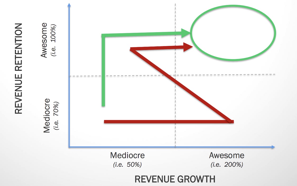
If you look at growth (adding new revenue) and retention (keeping and/or growing existing revenue) as two axes on a chart of overall growth, a couple of broad options present themselves to get the curve arrow up and to the right:
If you have awesome retention, you have to figure out adding new business. If you’re adding new customers like crazy but have trouble with customer churn, you have to figure out how to keep them. Roberge summed up his position after years of working with companies:
It’s easier to accelerate growth with world class retention than fix retention while maintaining rapid growth.
The literature across industries is also in agreement on this. There’s an adage in business that it’s “cheaper to keep a customer than to acquire a new one.” But to me there’s more to this notion than the avoidance of the acquisition cost for a new customer, though that’s certainly beneficial. Rather it’s the maximization of the magic SaaS metric: LTV (lifetime value). If a subscription customer never leaves, their revenue keeps growing ad infinitum. This is the sort of efficiency ever SaaS company is striving for — to maximize fixed investments over the long term. It’s why investors are valuing SaaS businesses at 10x revenue these days. But you can’t get there without unlocking the right product-market fit to switch on this kind of retention and growth.
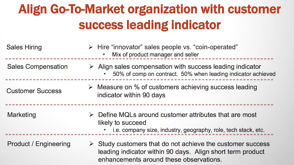
So Roberge recommends keying in on this factor. One of the key first steps in establishing a strong position with any customer is to have a clear definition of when they cross a product fit threshold — when they reach the “aha” moment and see the value for themselves. He calls this the “customer success leading indicator”, and explains that all companies should develop a metric or set of metrics that indicates when customers cross this mark. Some examples from around the SaaS universe of how companies are measuring this:
Slack — 2000 team messages sent
Dropbox — 1 file added to 1 folder on 1 device
Hubspot — Using 5 of 20 features within 60 days
Each of these companies has correlated these figures with strong customer fits. When these targets are hit, there’s a high likelihood that a customer will convert, stick around, and even expand. It’s important that the selected indicator be clear and consistent between customers and meet some core criteria:
Observable in weeks or months, not quarters or years — need to see rapid feedback on performance.
Measurement can be automated — again, need to see this performance on a rolling basis.
Ideally correlated to the product core value proposition — don’t pick things that are “measurable” but don’t line up with our expectations of “proper use.” For example, in Fulcrum, whether the customer creates an offline map layer wouldn’t correlate strongly with the core value proposition (in isolation).
Repeat purchase, referral, setup, usage, ROI are all common (revenue usually a mistake — it’s a lagging rather than a leading indicator)
Okay to combine multiple metrics — derived “aggregate” numbers would work, as long as they aren’t overcomplicated.
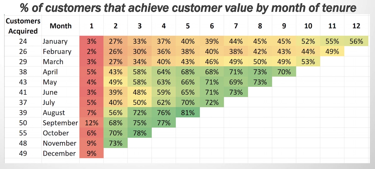
The next step is to understand what portion of new customers reach this target (ideally all customers reach it) and when, then measure by cohort group. Putting together cohort analyses allows you to chart the data over time, and make iterative changes to early onboarding, product features, training, and overall customer success strategy to turn the cohorts from “red” to “green”.
We do cohort tracking already, but it’d be hugely beneficial to analyze and articulate this through a filter of a key customer success metric is and track it as closely as MRR. I think a hybrid reporting mechanism that tracks MRR, customer success metric achievement, and NPS by cohort would show strong correlation between each. The customer success metric can serve as an early signal of customer “activation” and, therefore, future growth potential.
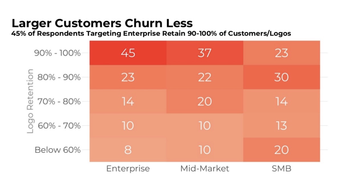
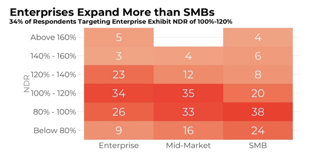
I also sat in on a session with Tom Tunguz, VC from RedPoint Ventures, who presented on a survey they had conducted with almost 600 different business SaaS companies across a diverse base of categories. The data demonstrated a number of interesting points, particularly on the topic of retention. Two of the categories touched on were logo retention and net dollar retention (NDR). More than a third of the companies surveyed retain 90+% of their logos year over year. My favorite piece of data showed that larger customers churn less — the higher products go up market, the better the retention gets. This might sound counterintuitive on the surface, but as Tunguz pointed out in his talk, it makes sense when you think about the buying process in large vs. small organizations. Larger customers are more likely to have more rigid, careful buying processes (as anyone doing enterprise sales is well aware) than small ones, which are more likely to buy things “on the fly” and also invest less time and energy in their vendors’ products. The investment poured in by an enterprise customer makes them averse to switching products once on board1:
On the subject of NDR, Tunguz reports that the tendency toward expansion scales with company size, as well. In the body of customers surveyed, those that focus on the mid-market and enterprise tiers report higher average NDR than SMB. This aligns with the logic above on logo retention, but there’s also the added factor that enterprises have more room to go higher than those on the SMB end of the continuum. The higher overall headcount in an enterprise leaves a higher ceiling for a vendor to capture:
Overall, there are two big takeaways to worth bringing home and incorporating:
Create (and subsequently monitor) a universal “customer success indicator” that gives a barometer for measuring the “time to value” for new customers, and segment accordingly by size, industry, and other variables.
Focus on large Enterprise organizations — particularly their use cases, friction points to expansion, and customer success attention.
We’ve made good headway a lot of these findings with our Enterprise product tier for Fulcrum, along with the sales and marketing processes to get it out there. What’s encouraging about these presentations is that we already see numbers leaning in this direction, aligning with the “best practices” each of these guys presented — strong logo retention and north of 100% NDR. We’ve got some other tactics in the pipeline, as well as product capabilities, that we’re hoping bring even greater efficiency, along with the requisite additional value to our customers.
Assuming there’s tight product-market fit, and you aren’t selling them shelfware! ↩
Love to see the Rays getting some deserved attention in the mainstream sports media. They’ve put together a great, diverse lineup of consistent hitters that have performed well all season:
The Rays emphasize power now, but in a different way: Through Monday, their hitters had the highest exit velocity in the majors, at 90.1 miles per hour, and their pitchers — who specialize in curveballs and high fastballs — allowed the lowest, at 86.3. Hard-contact rates enticed them to trade for Pham from St. Louis last July, and to land Yandy Diaz in an off-season deal with Cleveland. Pham was hitting .248 for the Cardinals, but the Rays assured him he had simply been unlucky; he hit .343 the rest of the season.
And I get to post this on the back of their 11th inning win over the Yankees this afternoon.
Great quick read from Horace Dediu on Apple’s Services business. As he points out in the piece, Apple’s business model is continually oversimplified and/or misunderstood by many:
This disconnect between what people think Apple sells and what Apple builds is as perplexing as the cognitive disconnect between what companies sell and what customers buy.
Companies sell objects or activities that they can make or engage in but customers buy solutions to problems. It’s easy to be fooled that these are interchangeable.
Conversely Apple offers solutions to problems that are viewed, classified, weighed and measured as objects or activities by external observers. Again, it’s easy to be fooled that these are the same.
This post goes into how the author put together a visualization of tornado trend data for Axios. Observable notebooks are so great. The interactivity lets you not only see the code and data to create it all, but can be forked and edited right there.
This is an interesting project on GitHub for syncing data from the Strava API for analysis from a local database. I’ve had my eye out for some way to do this cleanly — to use the Strava Activities API to sync each track and its metadata to a local Postgres database. My interest is in being able to put the tracks on a map (mostly), but some of the analysis shown here is pretty cool, too.
In this author’s case it’s about cycling data. I want to be able to run SQL on the global archive of activity data, like so: