Geospatial analytics company Descartes Labs recently sold to private equity, in what former CEO Mark Johnson calls a “fire sale.” This post is his perspective on the nature of the business over time, their missteps along the way in both company identity and fundraising, and some of the shenanigans that can happen as stakeholders start to head for the exits.
Not knowing much about Descartes’ actual business, either the original vision of the product or its actual delivery over the years, I don’t have much specific perspective to offer. But this story is a recurring theme in the world of spatial, earth observation, and analytics startups that have come and gone over the past 10 years or so. These businesses are built on extremely capital-intensive investments in satellites, space-based sensors, and data, which are major hurdles that cause many of them to get sideways in their fundraising structures very early in their business journeys.
The early years of a startup are always extremely volatile, with pivots and adjustments happening along the way as the company navigates the idea maze, looking for product-market fit. I think the heavy capital required up front compels funders to expect too much too soon in the product development process. There’s a chicken-and-egg problem — the PMF search in these kinds of businesses costs many millions. If you’re building a SaaS project management tool, you can wander around looking for fit for years with only a few people and limited seed money. But in satellite startups, the runway you need to do product-market experimentation is enormously expensive. Large enough funding pools also saddle the business with aggressive expectations for customer counts, growth, and revenue. With revenue targets set but no repeatable PMF, many of these startups do whatever they can to find dollars, which often leads to doing what are effectively custom services deals for a single or few customers. That’s necessary to make money of course, and it’s not valueless for product validation. But it’s too narrow to function as true PMF. Stay in this awkward state too long and you end up stuck down the wrong hallways of the idea maze. You’ll never find the fitness you need to build a lasting business. Billwrote a great post on this recently, about this identity struggle between being a solutions, services, or product company.
The best thinking on the topic of EO and satellite data companies is my friend Joe Morrison’s newsletter, “A Closer Look”. He leads product for Umbra, a startup specializing in SAR. He’s done a lot more thinking than me on this topic and has thoughtful takes on the satellite and geo market in general.
Byrne Hobart makes the case for Starlink’s business model:
The line between a vision and a sales pitch is always blurry, and Elon Musk is unusually good at using this to his advantage. There’s a reasonable case that Starlink is just a natural way to amortize the fixed cost of SpaceX’s investment in launch infrastructure. But a sufficiently compelling sales pitch has a way of coming true, and if part of the pitch of Starlink is that it’s a censorship-resistant communications medium that creates access to the global Internet, not individual countries’ more restricted versions of it, then that may be what it becomes.
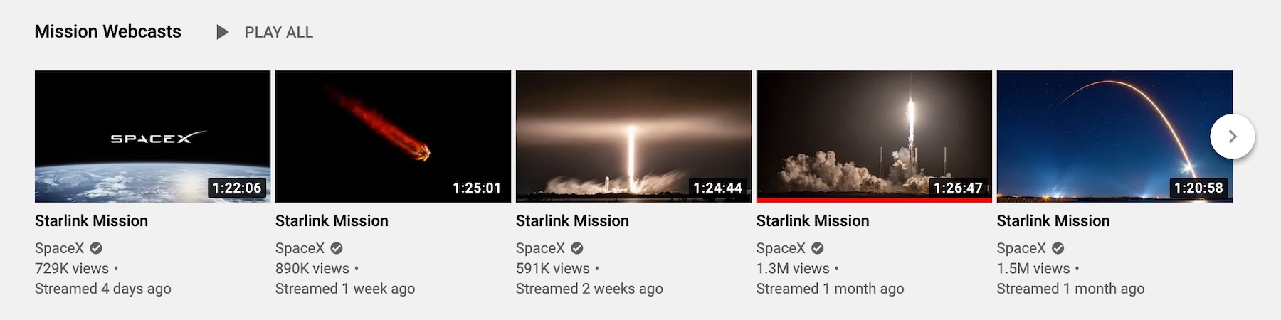
I set an alert on the SpaceX YouTube channel a few months ago, which gives me a closer perspective on how much they’re investing in Starlink, their satellite internet constellation. Multiple times a month I get a notice of a live-streamed Falcon launch with a flock of new Starlink sensors being put into orbit.
Starlink's impressive deployment pace
Each of these payloads puts 60 new birds into space. Now Starlink is in beta with early customers, and I’ve seen some amazing posts from folks at their off-grid cabins, now with 300down/20up connections where they used to be dozens of miles from connectivity of any form.
This is a wild story and an incredible piece of investigative journalism from the folks at BuzzFeed. The CCP reportedly operates hundreds of camps across the Xinjiang autonomous region for re-education of Uyghur muslims.
Starting with map tiles they’d noticed were blanked out on China’s Baidu Maps service, they enlisted new data resources, built analysis tools, and combed through map data manually to identify hundreds of these prisons (only several dozen are “officially” known):
We began to sort through the mask tile locations systematically using a custom web tool that we built to support our investigation and help manage the data. We analyzed the whole of Kashgar prefecture, the Uighur heartland, which is in the south of Xinjiang, as well as parts of the neighboring prefecture, Kizilsu, in this way. After looking at 10,000 mask tile locations and identifying a number of facilities bearing the hallmarks of detention centers, prisons, and camps, we had a good idea of the range of designs of these facilities and also the sorts of locations in which they were likely to be found.
They used data tasked on-demand by Planet’s satellite constellation (and granted for free for the project, so big ups to the Planet team there!) to find hundreds more of these:
In total we identified 428 locations in Xinjiang bearing the hallmarks of prisons and detention centers. Many of these locations contain two to three detention facilities — a camp, pretrial administrative detention center, or prison. We intend to analyze these locations further and make our database more granular over the next few months.
Of these locations, we believe 315 are in use as part of the current internment program — 268 new camp or prison complexes, plus 47 pretrial administrative detention centers that have not been expanded over the past four years.
This story gets more shocking every day. It’s hard to believe the resounding silence pretty much worldwide of any government response to this going on. Eric Weinstein recently had a podcast episode about Arthur Koestler’s (author of Darkness at Noon 1944 essay called “The Nightmare That is a Reality,” in which Koestler marvels at the world’s lack of belief and response to the ongoing Holocaust. It was written long before the Allies began to liberate the camps and see for themselves in person what was going on.
Today we have cameras in the sky capable of bypassing lying, twisted regimes of secrecy, but don’t seem to want to believe the truth any more now than we did in 1944.
Geoff Zeiss on combining satellite imagery and spatial analysis to identify tree encroachment in utilities:
Transmission line inspections are essential in ensuring grid reliability and resilience. They are generally performed by manned helicopters often together with a ground crew. There are serious safety issues when inspections are conducted by helicopter. Data may be collected with cameras and analyzed to detect a variety of conditions including corrosion, evidence of flash over, cracks in cross arms, and right-of-way issues such as vegetation encroachment. in North America annual inspections are mandated by NERC and are not optional. With over 200,000 miles of high-voltage transmission lines and 5.5 million miles of distribution lines in the United States, improving the efficiency and reducing the risk of inspections would have a major impact on the reliability of the power grid.
Google Sheets now supports using BigQuery data inside of Google Sheets features like pivot tables and formulas, which means orders-of-magnitude increase in data limits.
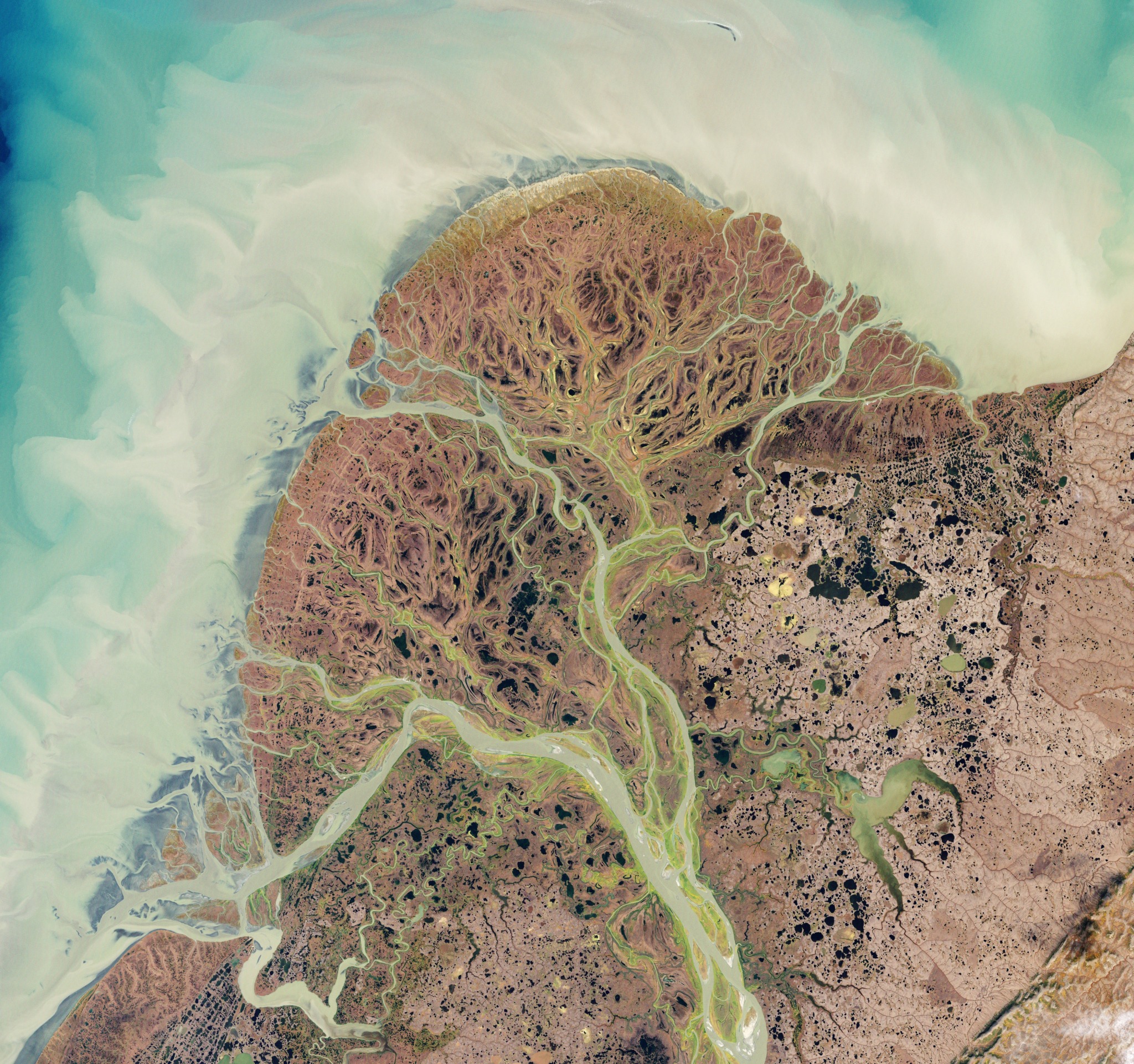
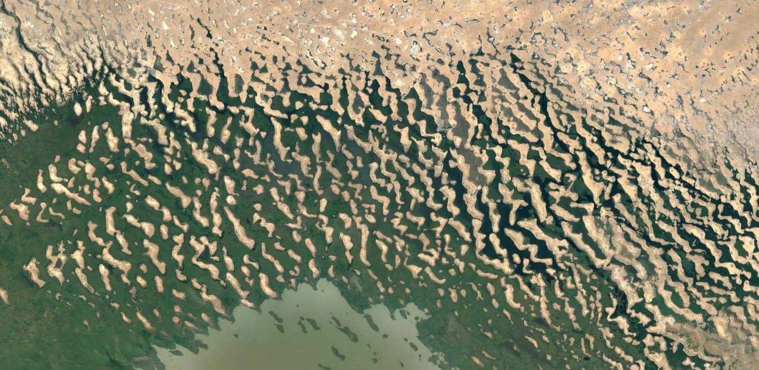
Lake Chad spans 4 national borders in the central Sahel: Niger, Nigeria, Chad, and Cameroon. Since the 1960s it’s shrunk to about 5% its ancestral size, due to overuse, mismanagement, and climate shifts.
This NASA photo uses SRTM data combined with Landsat 8 to highlight the edges of the basin that was once the size of the Caspian Sea:
About 7,000 years ago, a vast lake spread hundreds of square kilometers across north-central Africa. Known to scientists as Lake Mega Chad, it covered more than 400,000 square kilometers (150,000 square miles) at its peak, making it slightly larger than the Caspian Sea, the biggest lake on Earth today.
Modern Lake Chad has shrunk to just a fraction of its former size, but evidence of the lake’s ancient shorelines is still etched into desert landscapes — hundreds of kilometers from the shores of the modern lake.
If you look at the Lake today on Google Earth, you’ll see some amazing landforms where the Saharan dunes transition to swampland on the shores of the basin. There’s some incredibly high-resolution data in that region:
Bessemer maintains this page of companies they passed investing on. I like the idea of publicly acknowledging your big misses or errors as an organizational accountability tool. Some big names here like eBay, Airbnb, Google, and FedEx.
Almost a year ago I shared a link to the first version of Downlink. The main feature added here is you can create your own custom views by putting a bounding box around your area of interest. Then you’ll get a live look at the Earth as your desktop background.
A collection tool for retrieving and analyzing Twitter data. I’ve seen some neat social network analyses shared from folks that have used this to map degree relationships between Twitter accounts.
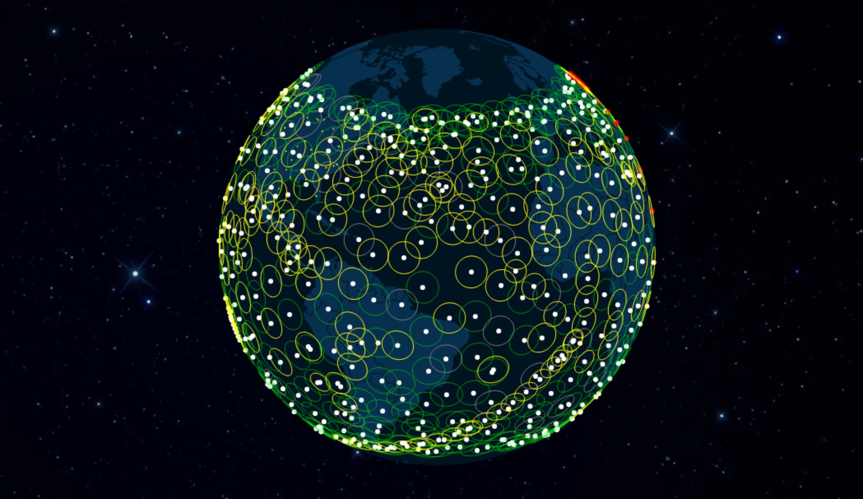
An interesting detailed analysis on SpaceX’s Starlink project, which intends to put tens of thousands of microsatellites in orbit to provide a blanket of global internet connectivity.
Starlink’s world-spanning internet will bring high quality internet access to every corner of the globe. For the first time, internet availability will depend not on how close a particular country or city comes to a strategic fiber route, but on whether it can view the sky. Entrepreneurs the world over will have unfettered access to the global internet irrespective of their own variously incompetent and/or corrupt government telco monopolies. Starlink’s monopoly-breaking capacity will catalyze enormous positive change, bringing, for the first time, billions of humans into our future global cybernetic collective.
In the category of good news, this study from NASA using MODIS satellite data shows trends of re-greening happening in countries like India and China. Surprising given the media attention on overexploitation of land:
The world is literally a greener place than it was 20 years ago, and data from NASA satellites has revealed a counterintuitive source for much of this new foliage: China and India. A new study shows that the two emerging countries with the world’s biggest populations are leading the increase in greening on land. The effect stems mainly from ambitious tree planting programs in China and intensive agriculture in both countries.
Pleasantly shocking numbers on the quantity this amounts to:
Taken all together, the greening of the planet over the last two decades represents an increase in leaf area on plants and trees equivalent to the area covered by all the Amazon rainforests. There are now more than two million square miles of extra green leaf area per year, compared to the early 2000s – a 5% increase.
Blot is a super-minimal open source blogging system based on plain text files in a folder. It supports markdown, Word docs, images, and HTML — just drag the files into the folder and it generates web pages. I love simple tools like this.
An interesting post from Robert Simmon from Planet. These examples of visualizations and graphics of physical phenomena (maps, cloud diagrams, drawings of insects, planetary motion charts) were all hand-drawn, in an era where specialized photography and sensing weren’t always options.
A common thread between each of these visualizations is the sheer amount of work that went into each of them. The painstaking effort of transforming a dataset into a graphic by hand grants a perspective on the data that may be hindered by a computer intermediary. It’s not a guarantee of accurate interpretation (see Chapplesmith’s flawed conclusions), but it forces an intimate examination of the evidence. Something that’s worth remembering in this age of machine learning and button-press visualization.
I especially love that Apollo mission “lunar trajectory” map.
Descartes Labs built a wildfire detection algorithm and tool that leans on NASA’s GOES weather satellite thermal spectrum data, in order to detect wildfires by temperature:
While the pair of GOES satellites provides us with a dependable source of imagery, we still needed to figure out how to identify and detect fires within the images themselves. We started simple: wildfires are hot. They are also hotter than anything around them, and hotter than at any point in the recent past. Crucially, we also know that wildfires start small and are pretty rare for a given location, so our strategy is to model what the earth looks like in the absence of a wildfire, and compare it to the situation that the pair GOES satellites presents to us. Put another way our wildfire detector is essentially looking for thermal anomalies.
A project from DeepMind designed to fill in missing text from ancient inscriptions:
Pythia takes a sequence of damaged text as input, and is trained to predict character sequences comprising hypothesised restorations of ancient Greek inscriptions (texts written in the Greek alphabet dating between the seventh century BCE and the fifth century CE). The architecture works at both the character- and word-level, thereby effectively handling long-term context information, and dealing efficiently with incomplete word representations (Figure 2). This makes it applicable to all disciplines dealing with ancient texts (philology, papyrology, codicology) and applies to any language (ancient or modern).
I haven’t read much Chinese history, but its origins and the Mao years were one of the greatest tragedies. And it’s frightening how much of that attitude is still there under the facade:
China today, for any visitor who remembers the country from 20 or 30 years ago, seems hardly recognizable. One of the government’s greatest accomplishments is to have distanced itself so successfully from the Mao era that it seems almost erased. Instead of collective poverty and marching Red Guards, there are skyscrapers, new airports, highways, railway stations, and bullet trains. Yet scratch the glimmering surface and the iron underpinnings of the one-party state become apparent. They have barely changed since 1949, despite all the talk about “reform and opening up.” The legacy of liberation is a country still in chains.
Most people don’t know how earth imaging satellites work. All they know is a camera is flying overhead snapping photos. This visualization gives you an animated picture of how Planet’s satellite constellation can cover the entire globe every day for a continuously-updated view of the Earth:
In four years, Planet has flown on 18 successful launches and deployed 293 satellites successfully into low Earth orbit. With more than 150 satellites currently in orbit, Planet has the largest constellation of Earth imaging satellites in history.
Amazing that we’ve got this kind of capability with microsatellite technology. Right now most of the sensors (the “Doves”) give 3m resolution, but this’ll just keep getting better.
Fantastic visualizations from the WSJ team. Shows the history of satellite expansion divided by country, year, and orbits, both LEO and geosynchronous. A great use of maps for storytelling.
This is a concept pulled from Taleb’s The Black Swan, which I recently enjoyed. As he notes, the antilibrary can function as a reminder of how much there is to know, and (as is a main point of The Black Swan, we tend to underestimate the value of what we don’t know).
The writer Umberto Eco belongs to that small class of scholars who are encyclopedic, insightful, and nondull. He is the owner of a large personal library (containing thirty thousand books), and separates visitors into two categories: those who react with “Wow! Signore professore dottore Eco, what a library you have. How many of these books have you read?” and the others—a very small minority—who get the point is that a private library is not an ego-boosting appendages but a research tool. The library should contain as much of what you do not know as your financial means … allow you to put there. You will accumulate more knowledge and more books as you grow older, and the growing number of unread books on the shelves will look at you menacingly. Indeed, the more you know, the larger the rows of unread books. Let us call this collection of unread books an antilibrary.
Definitely rings familiar, for me, as someone with a large collection of books I’m anxious to read, but may never get to.
The Facebook-designed and sponsored Libra is a more interesting idea than the much-discussed “FacebookCoin” entrance into cryptocurrency that’s been rumored. The gist is that it’s somewhere between an open blockchain and a closed system, with a consortium of funders in place to share control and add stability in the currency. I’m interested to see where this goes given Facebook’s massive reach to expose it to regular people. See also Ben Thompson’s sharp analysis of Libra from earlier this week.
As pointed out in this piece from Rahul Vohra, founder of Superhuman, most indicators around product-market fit are lagging indicators. With his company he was looking for leading indicators so they could more accurately predict adoption and retention after launch. His approach is simple: polling your early users with a single question — “How would you feel if you could no longer use Superhuman?”
Too many example methods in the literature on product development orient around asking for user feedback in a positive direction — things like “how much do you like the product?”, “would you recommend to a friend?” Coming at it from the counterpoint of “what if you couldn’t use it” reverses this. It makes the user think about their own experience with the product, versus a disembodied imaginary user that might use it. It brought to mind a piece of the Paul Graham essay “Startup Ideas”, if you go with the wrong measures of product-market fit:
The danger of an idea like this is that when you run it by your friends with pets, they don’t say “I would never use this.” They say “Yeah, maybe I could see using something like that.” Even when the startup launches, it will sound plausible to a lot of people. They don’t want to use it themselves, at least not right now, but they could imagine other people wanting it. Sum that reaction across the entire population, and you have zero users.
Remote work is creeping up in adoption as companies become more culturally okay with the model, and as enabling technology makes it more effective. In the tech scene it’s common for companies to hire remote, to a point (as Benedict Evans joked: “we’re hiring to build a communications platform that makes distance irrelevant. Must be willing to relocate to San Francisco.”) It’s important for the movement for large and influential companies like Stripe to take this on as a core component of their operation. Companies like Zapier and Buffer are famously “100% remote” — a new concept that, if executed well, gives companies an advantage against to compete in markets they might never be able to otherwise.
This year’s excellent report from the show floor from Steven Sinofsky. It’s extensive and covers the products a-to-z, breaking down the trends by category. I’d also recommend the companion podcast conversation between Sinofsky and Benedict Evans.
A helpful guide with tips and factoids on satellite imagery. Includes a primer on the various sensor platforms, differences in resolution, color correction, infrared, and more. There are also a ton of reference links for data and other things.
MacStories’ Federico Viticci is the undisputed king of Shortcuts on iOS. As I’ve spent more time with the iPad as a primary computing device, Shortcuts has become an essential way to create the automations that make repeated tasks easier.
The team from Planet, maker of microsatellites for remote sensing, shared this set of images taken by their SkySat constellation. As this technology advances, it’s going be a phenomenal resource to make high-accuracy 3D models of cities and terrain.
The Pearl islands, Doha
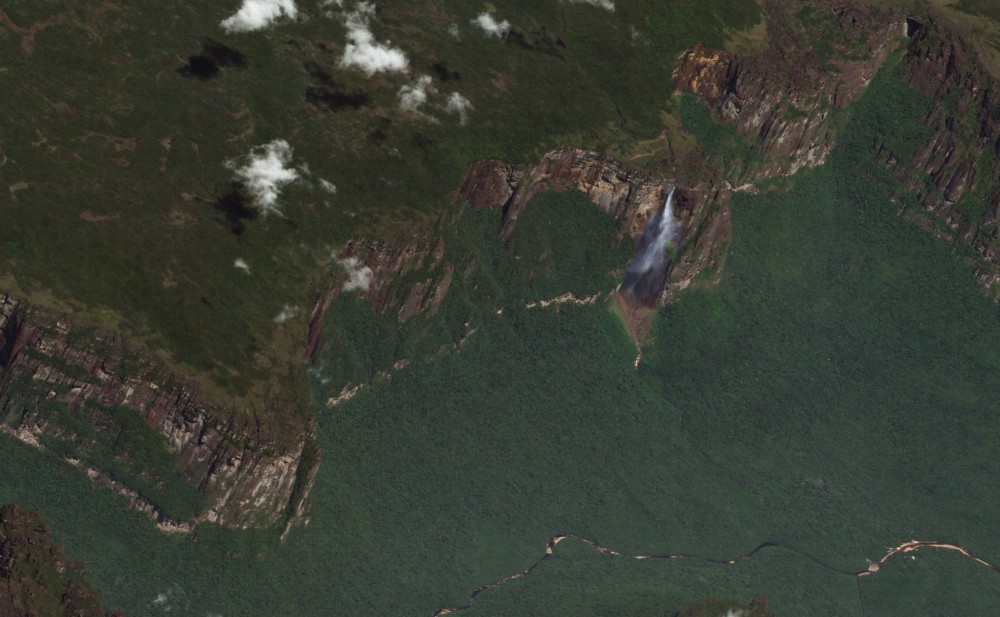
I love browsing Google Earth and looking at massive elevation differentials and escarpments like Yosemite or like Auyán Tepui, the tabletop mountain best known for Angel Falls:
LiDAR point cloud data for Washington, DC, is available for anyone to use on Amazon Simple Storage Service (Amazon S3). This dataset, managed by the District of Columbia’s Office of the Chief Technology Officer (OCTO), with the direction of OCTO’s Geographic Information System (GIS) program, contains tiled point cloud data for the entire District along with associated metadata.
This is a great move by the District to make high value open data available.
Ben Thompson breaks down the blame game of the latest zero-day attack on Windows systems. This article makes a great case for the business model being to blame rather than Microsoft, their customers, the government, or someone else. a SaaS business model naturally aligns incentives for everyone:
I am, of course, describing Software-as-a-service, and that category’s emergence, along with cloud computing generally (both easier to secure and with massive incentives to be secure), is the single biggest reason to be optimistic that WannaCry is the dying gasp of a bad business model (although it will take a very long time to get out of all the sunk costs and assumptions that fully-depreciated assets are “free”). In the long run, there is little reason for the typical enterprise or government to run any software locally, or store any files on individual devices. Everything should be located in a cloud, both files and apps, accessed through a browser that is continually updated, and paid for with a subscription. This puts the incentives in all the right places: users are paying for security and utility simultaneously, and vendors are motivated to earn it.
DG is opening up access to imagery for tracing in OpenStreetMap, giving the project a powerful new resource for more basemap data. Especially cool for HOTOSM projects:
Over the past few months, we have been working with several of our partners that share the common goal of improving OpenStreetMap. To that end, they have generously funded the launch of a global imagery service powered by DigitalGlobe Maps API. This will open more data and imagery to aid OSM editing. OSM contributors will see a new DigitalGlobe imagery source, in addition to imagery provided by our partners, Bing and Mapbox.